
Data visualizations are a key element of any BI dashboard. They can be so powerful, when done right, that you might be tempted to skim them and not really appreciate what goes into making them. But that’s also the point…for you to not have to think deeply and intensely.
At Nowsight, significant time and business expertise goes into each and every data visualization or graph we create. Because we know that presenting data in a way that sparks action is the key.
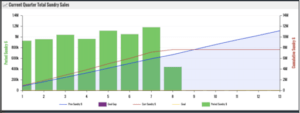
We often find ourselves developing data visualizations with multiple graph types–like bars, trend lines and mountain charts–overlaid, so clients can very quickly see not just how they performed this month, or last month, but how they compare to their previous periods and to their goals. It makes a single visualization tap into multiple data sets to provide a single, crisp view.
The key to good visualizations is the ability to show where you are at that moment in time and where you should be against goals–so you don’t have to make up at the end of quarter/period. This means you don’t have dashboard dials that stay red right up till the end of the month when you hit your target. Because those aren’t useful or motivating. Instead, you can see how you should be tracking, day by day, to ensure you don’t start slipping behind.
Simply Powerful Data Visualizations
We hear this all the time: “I can now see exactly where to focus our efforts!” That’s the power of BI, done well. It makes complex data sets seem simple.
It’s important to note that these visualizations go well beyond the functions available in an excel spreadsheet. First, they are real-time and always up to date. You never have to refresh the chart or table in an excel spreadsheet to find your answer. Second, these are customized to your business based on 50+ years of business leadership experience and the unique needs of your organization. Should profit and sales be shown by account, by invoice or by month? Should the sales team be stack ranked by raw sales volume or profitability?
The right information, to the right people, at the right time
In addition, people shouldn’t be required to login to the system to see performance. Gone are the days of limited licenses of who can see what–all that does is create data gatekeepers! You should expect your BI system to deliver narrative emails specific to individuals and immediate text alerts so employees have the power to know their performance in real-time and react to issues that might grow if not addressed promptly.
Are you ready to see the power of mountains (charts) in your business? Let’s talk.